EXPRESS SOLICITORS
EXPRESS SOLICITORS
Branding. Graphic design. Web. Social.
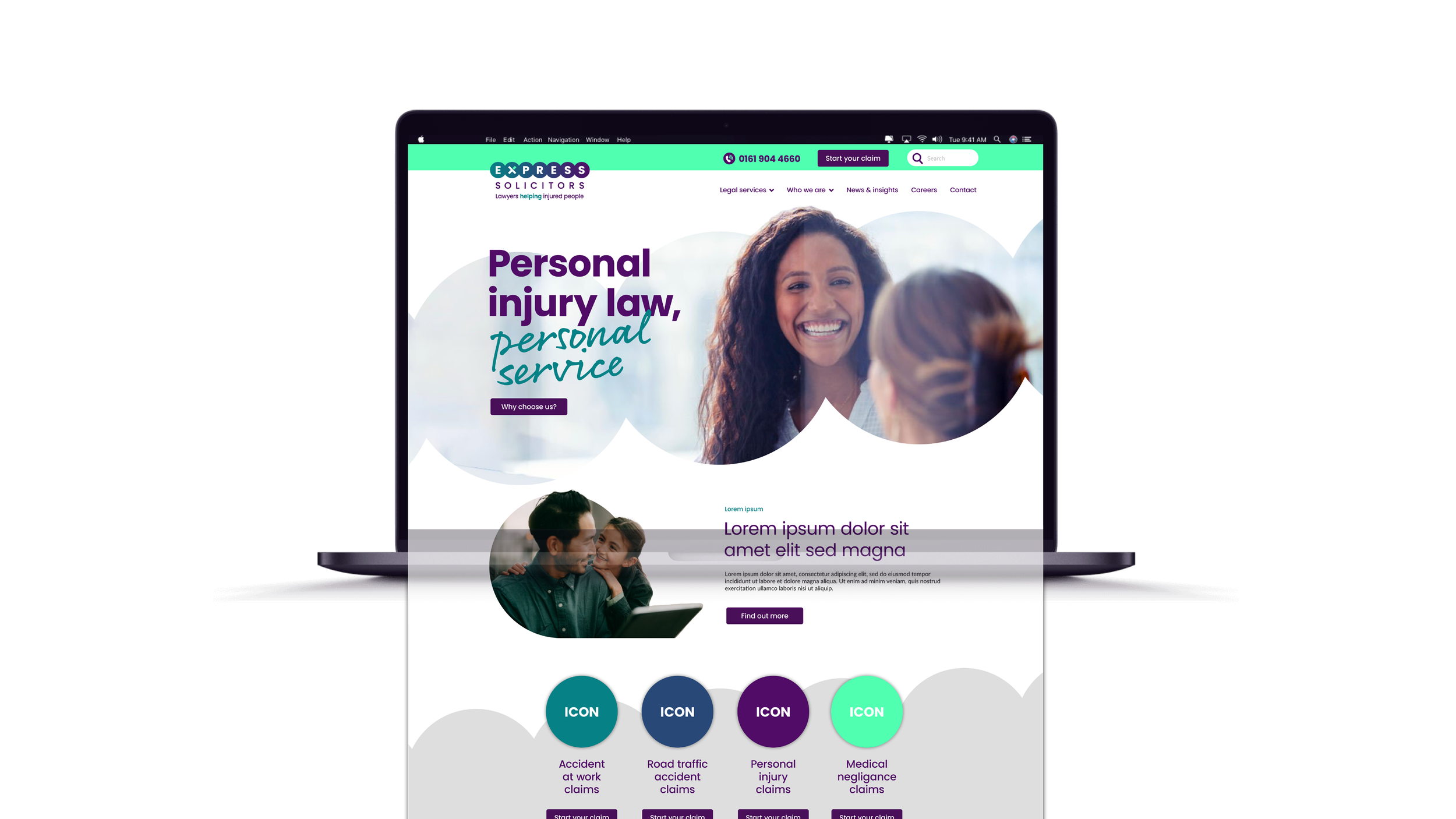
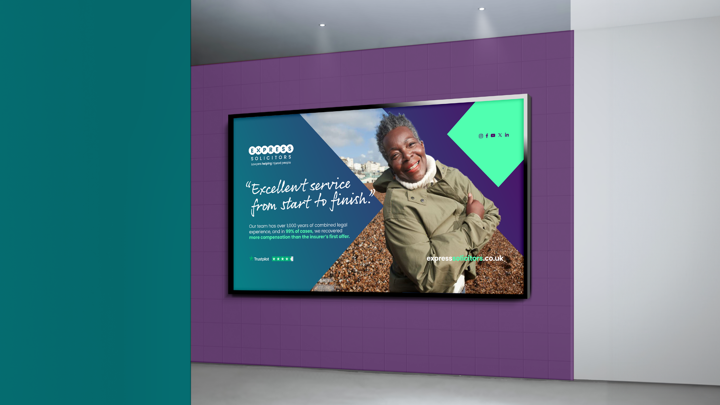
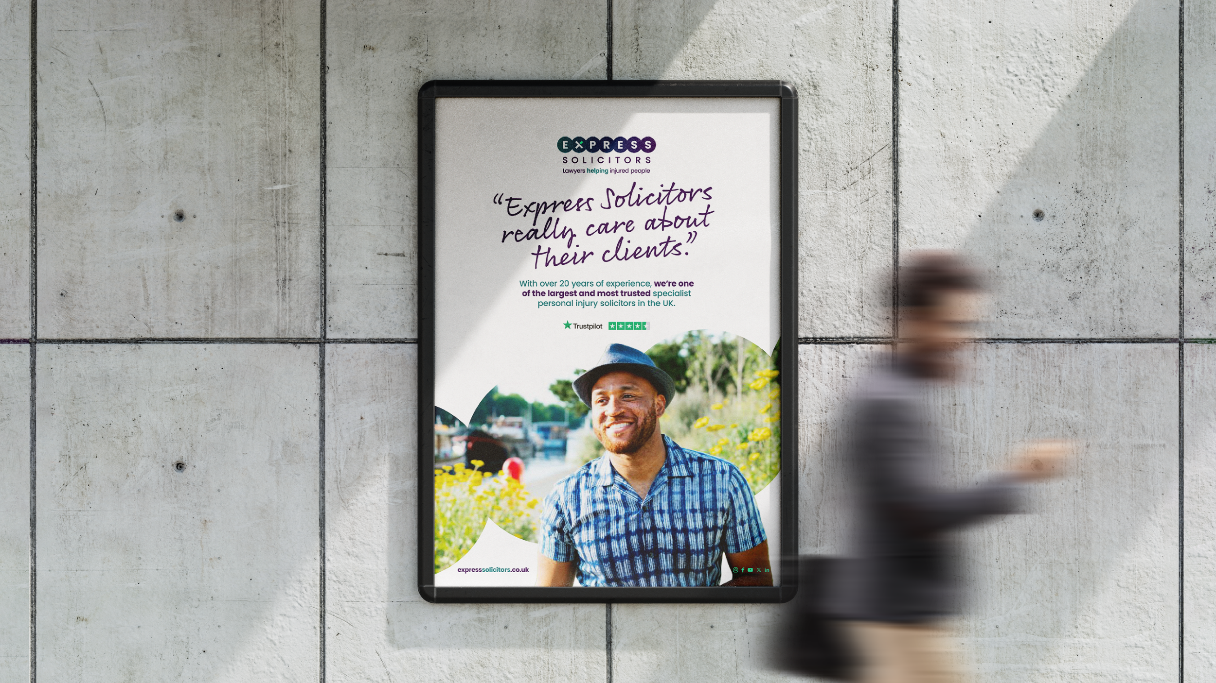
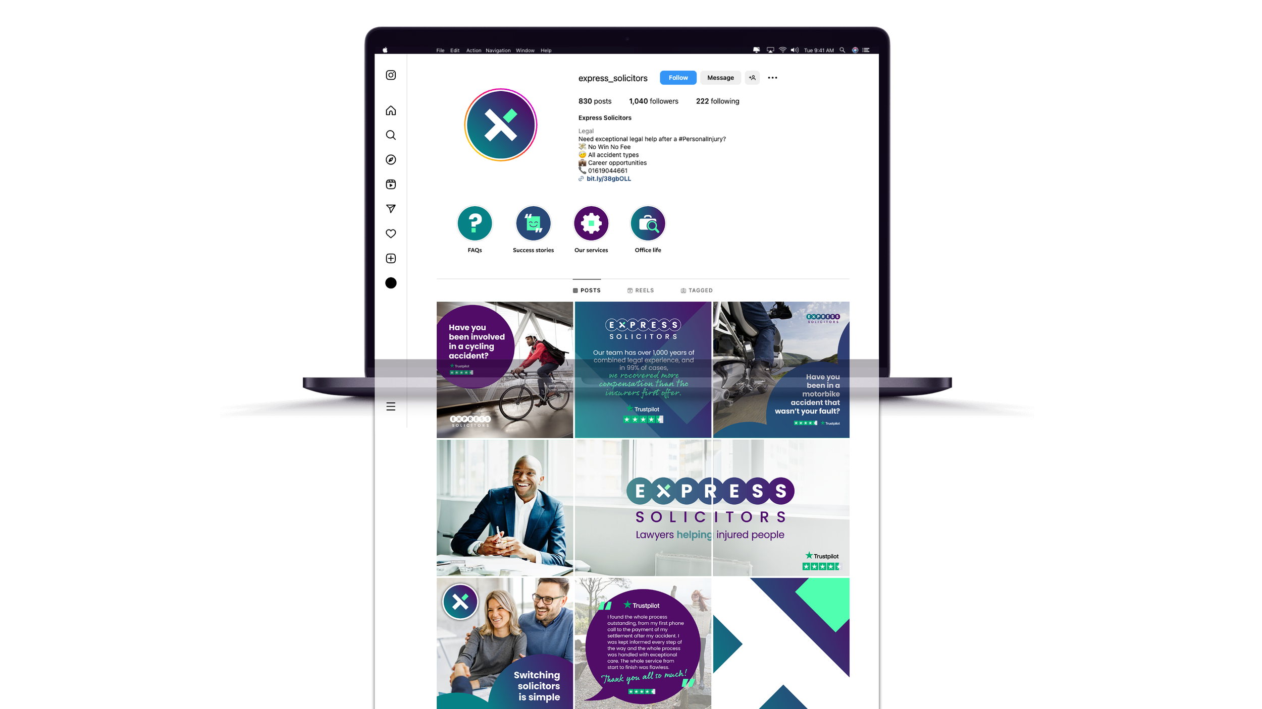
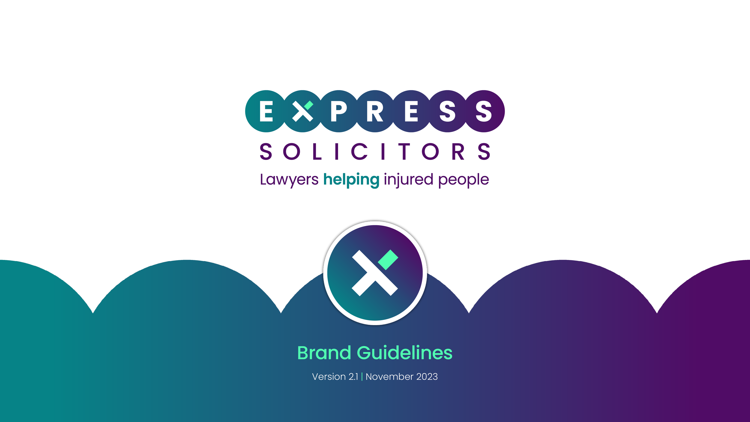
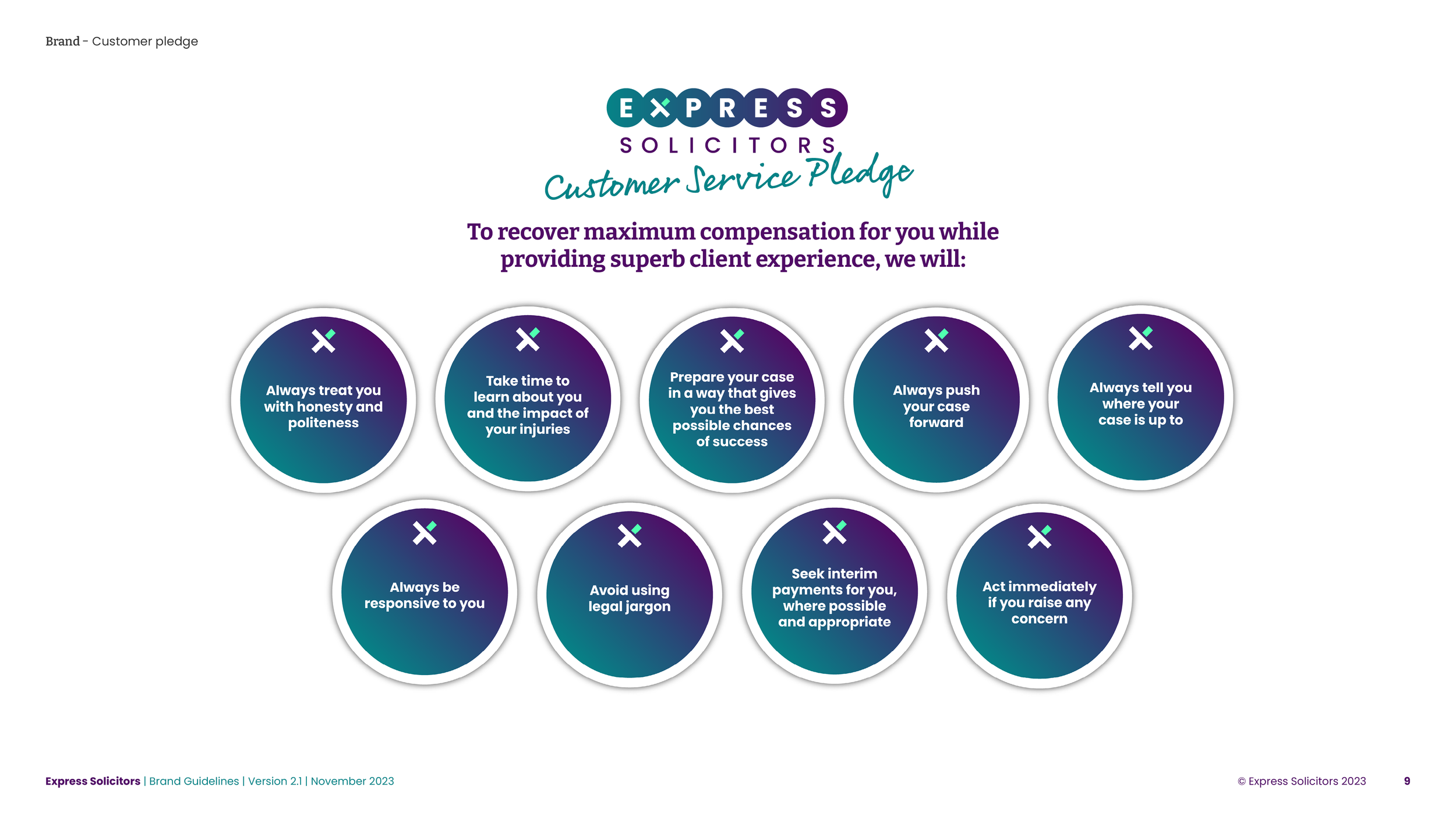
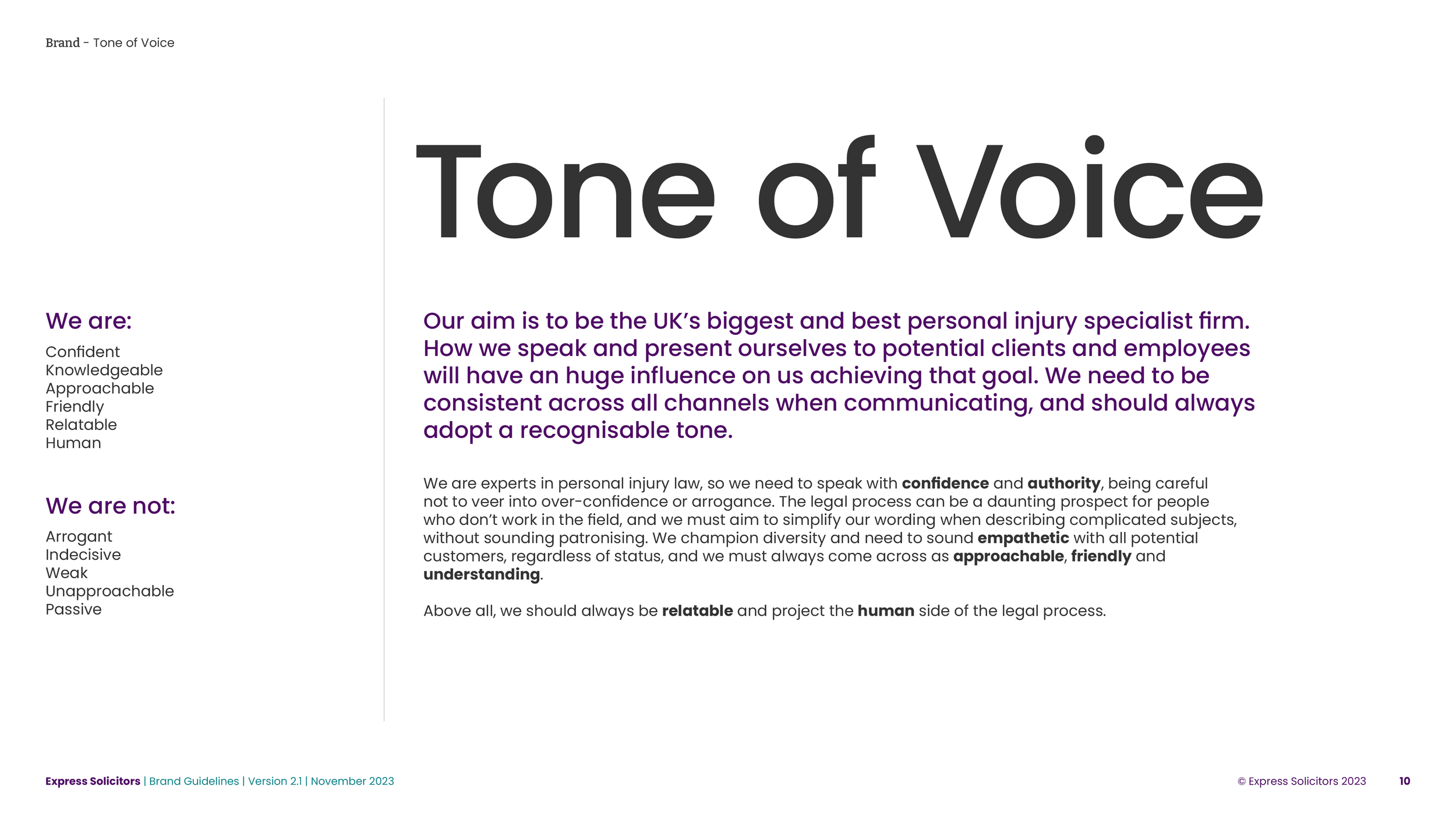
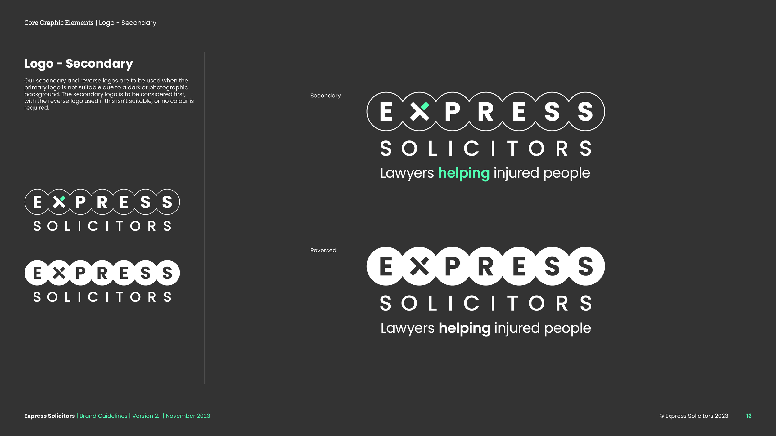
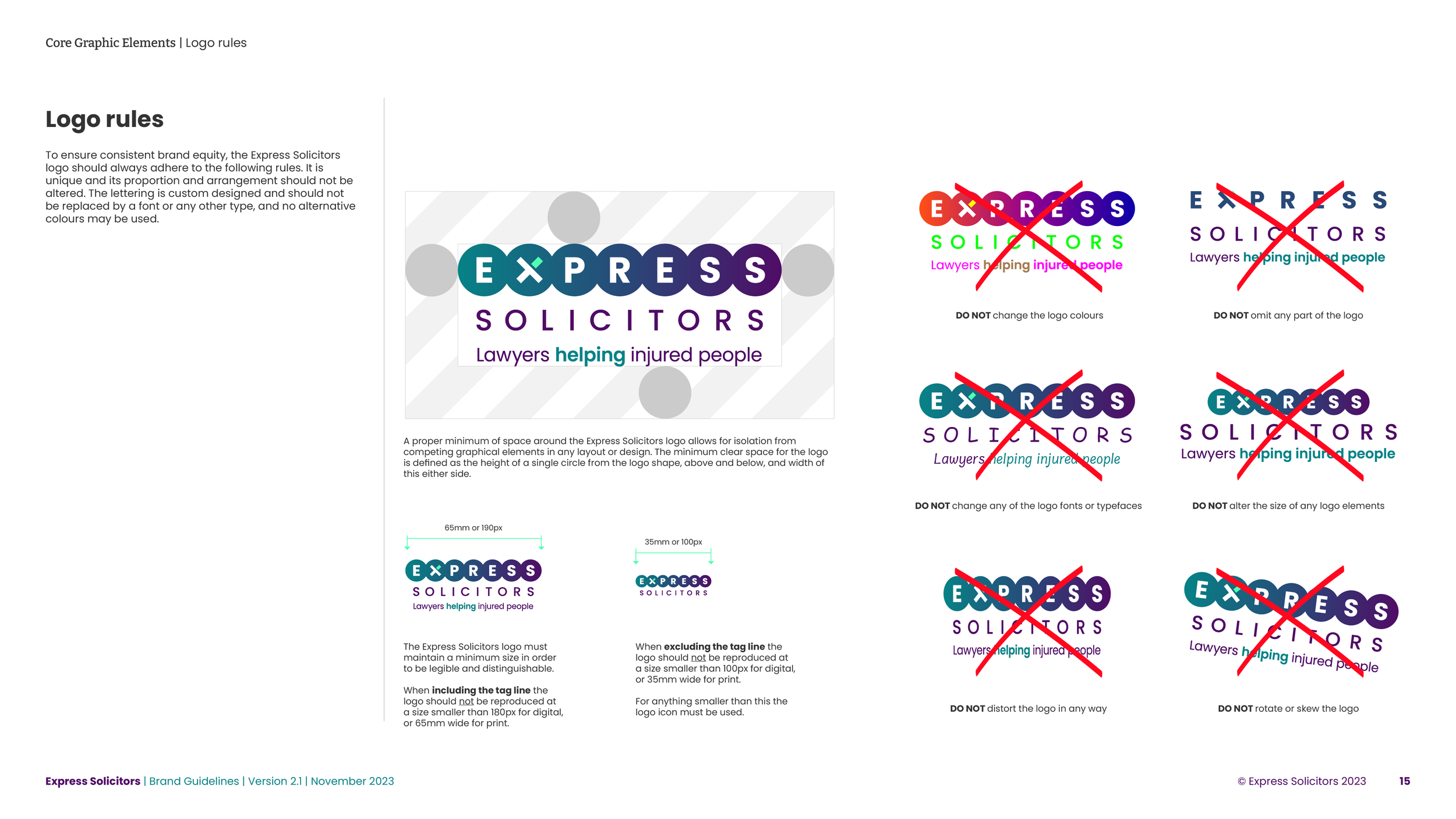
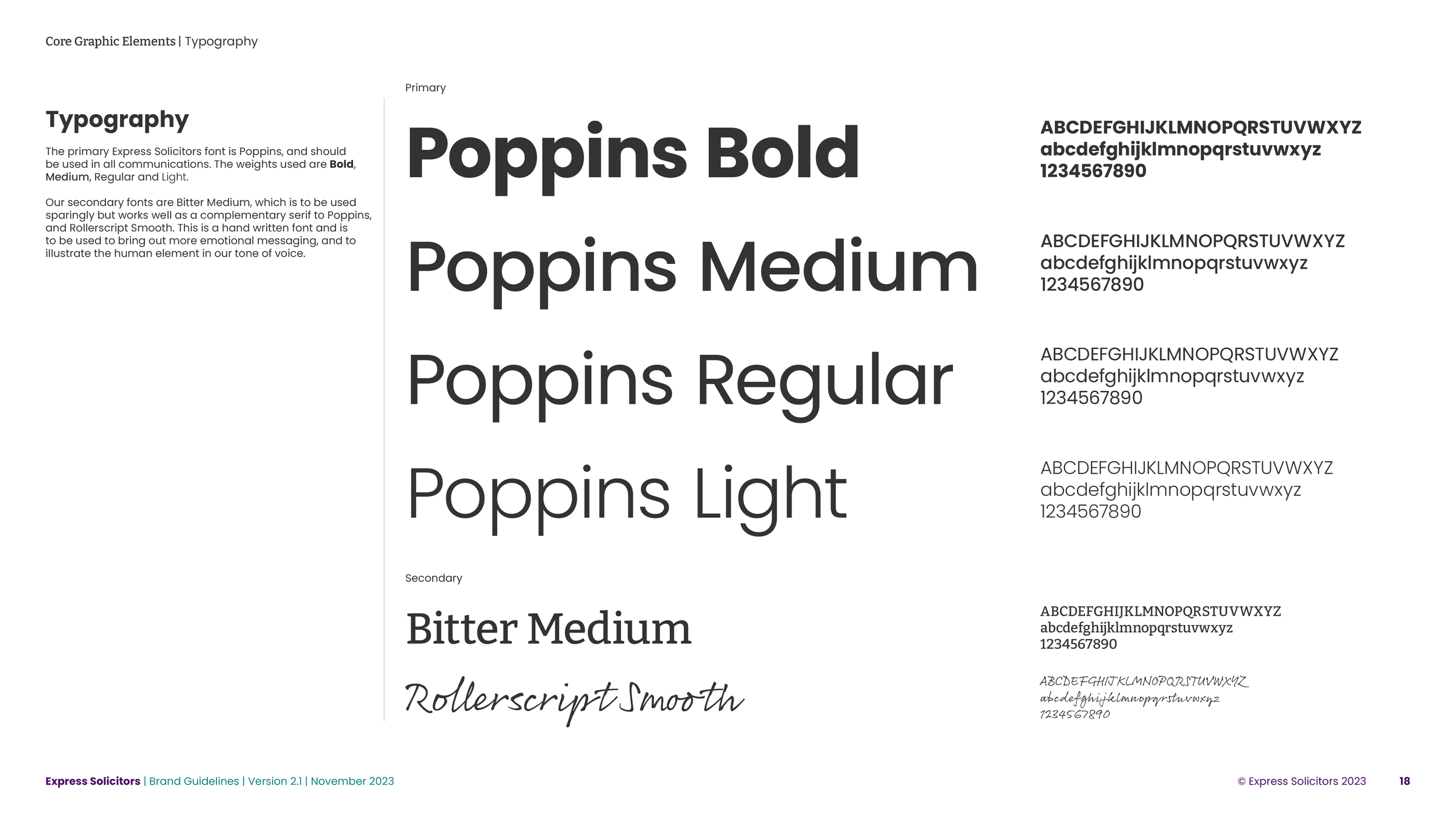
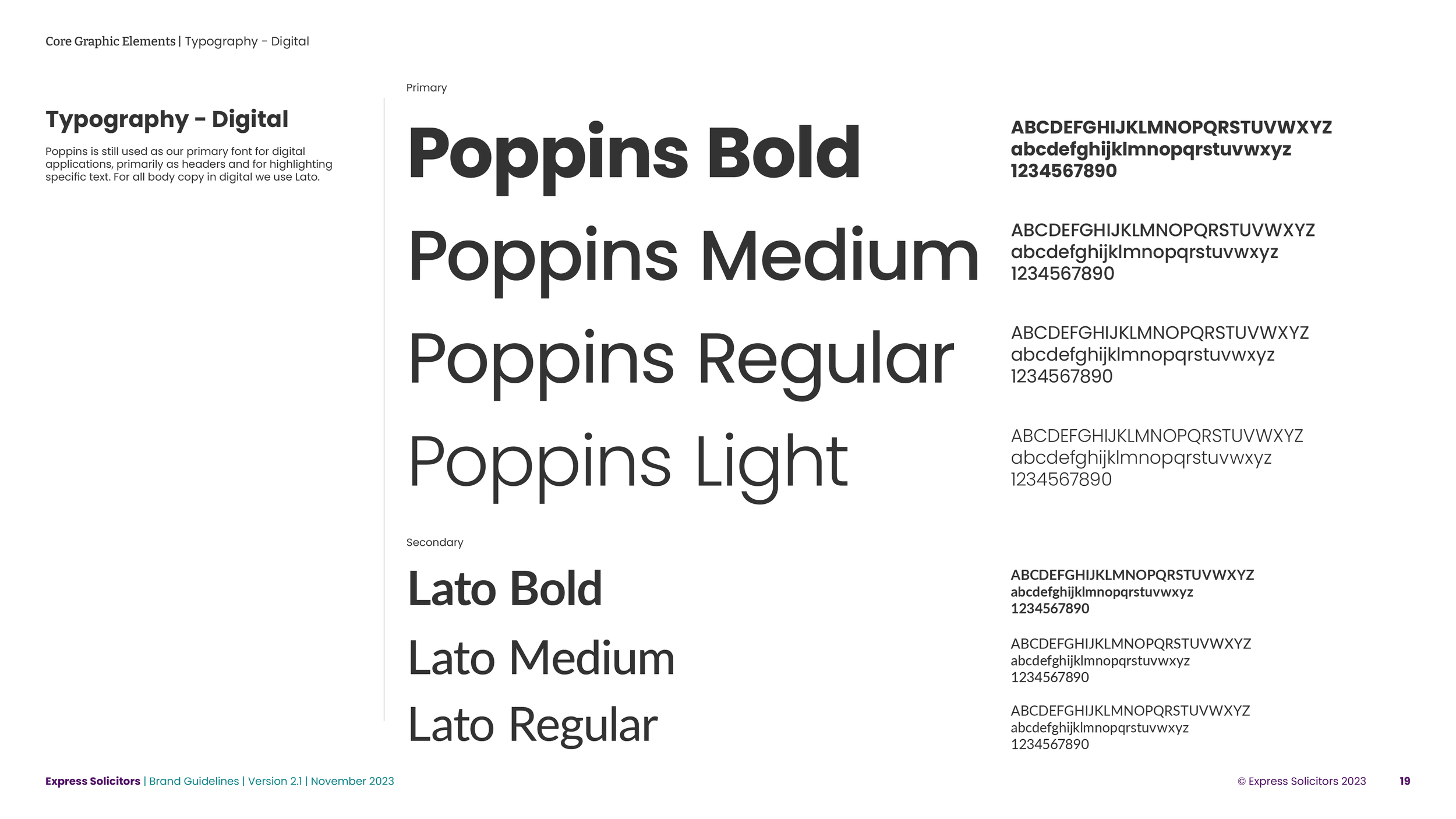
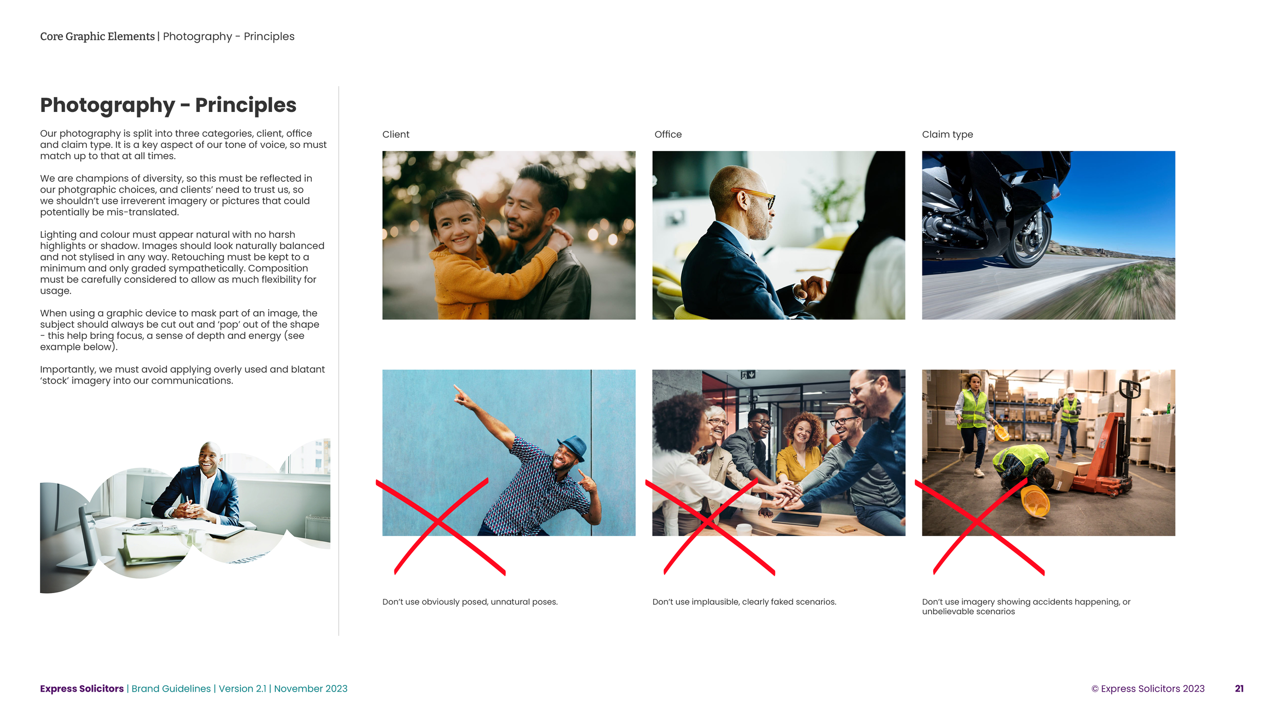
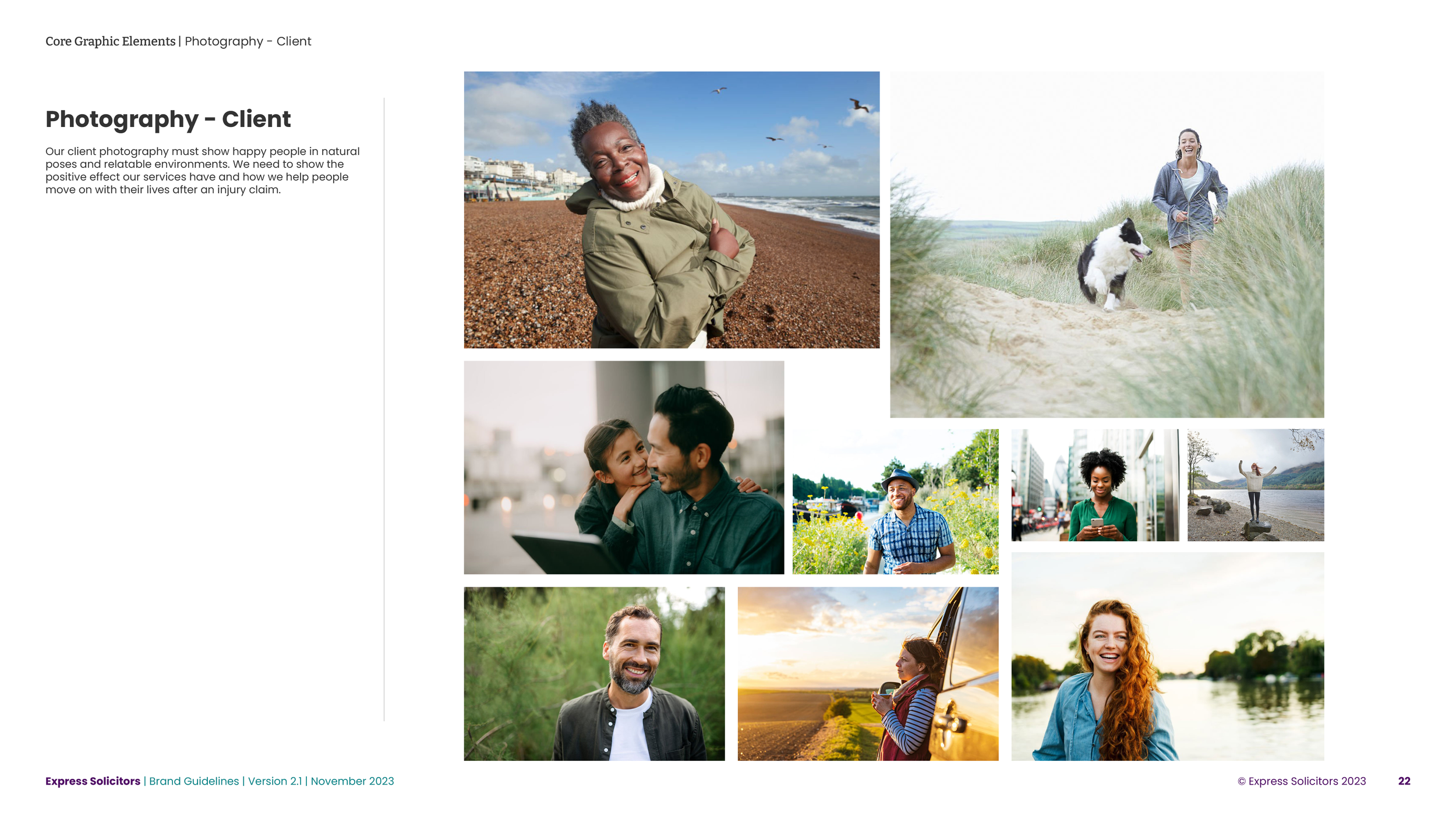
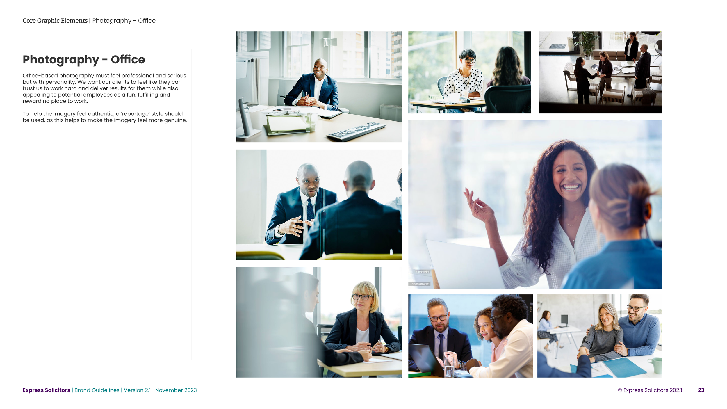
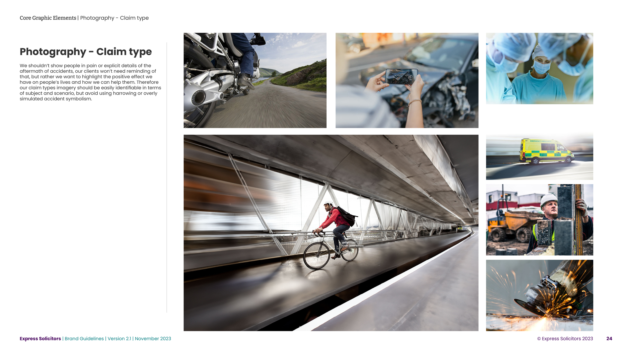
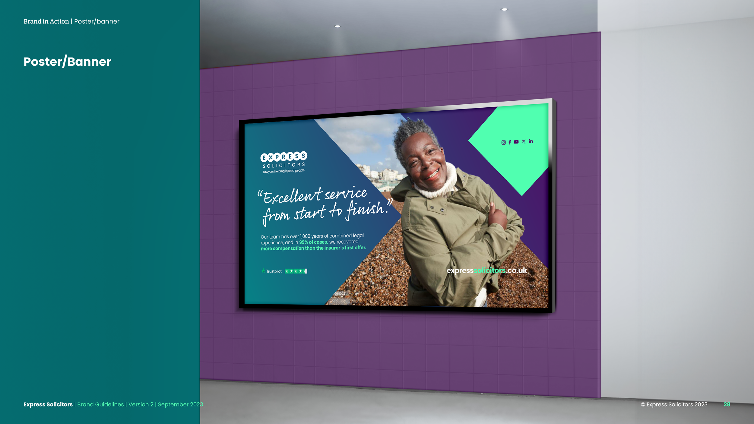
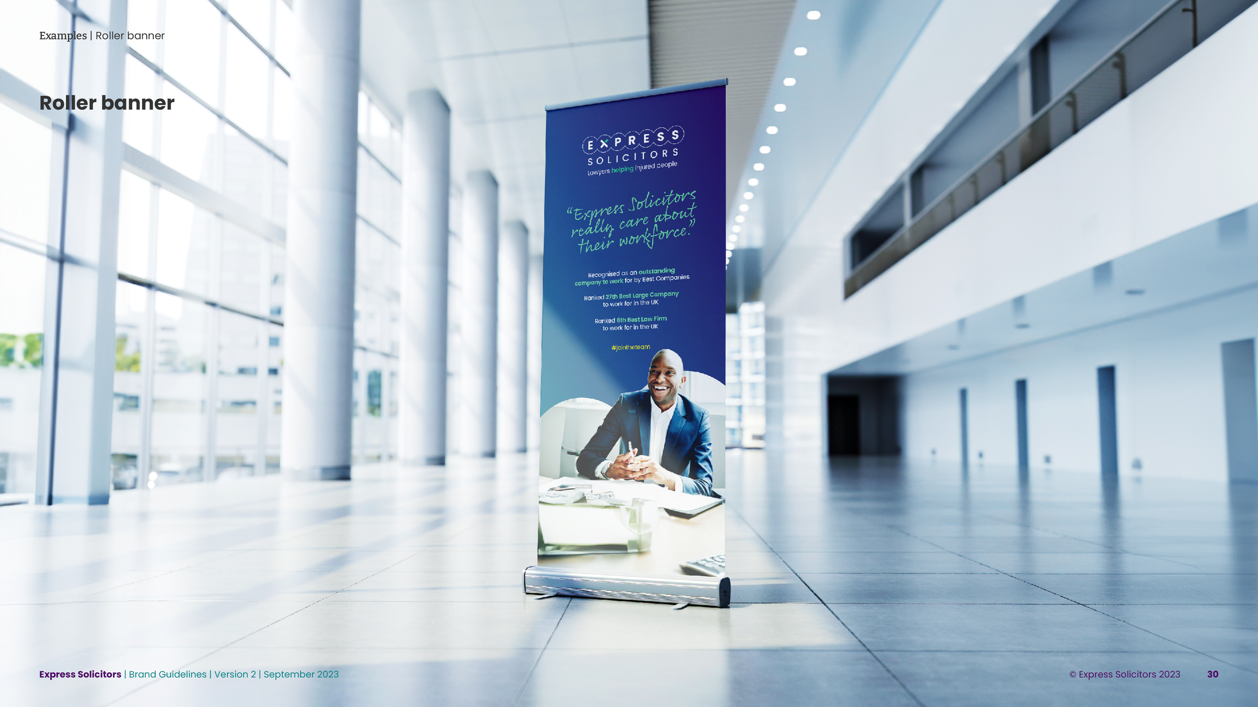
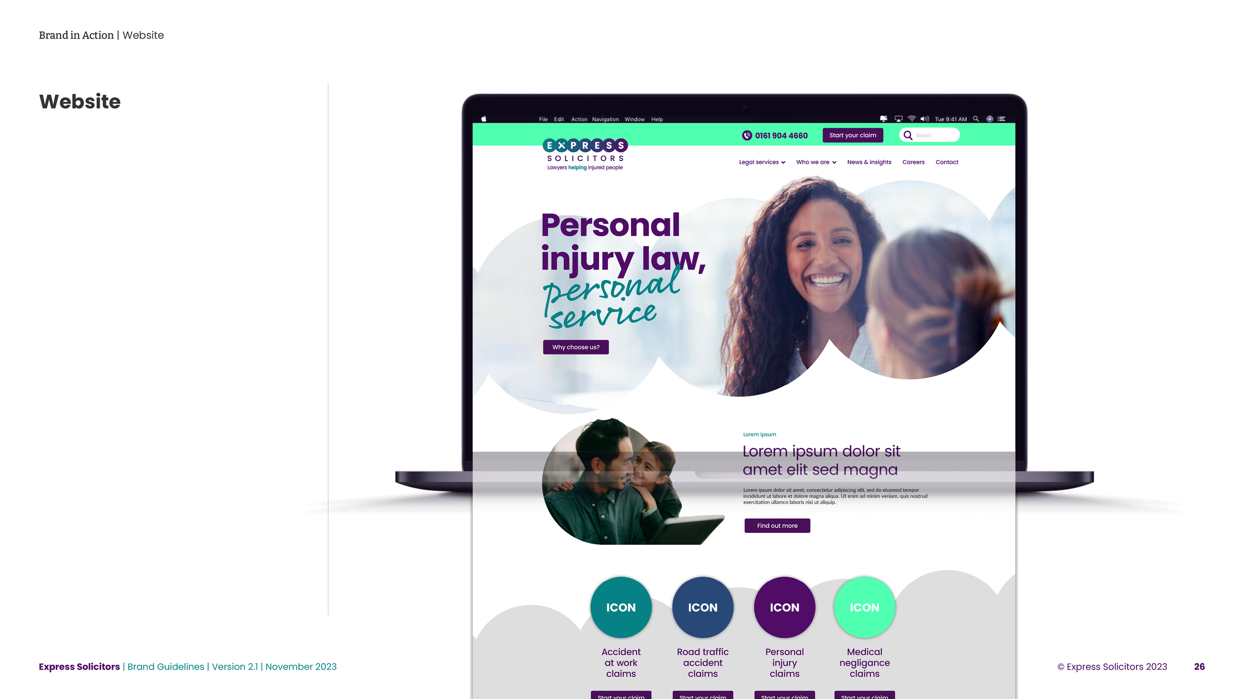
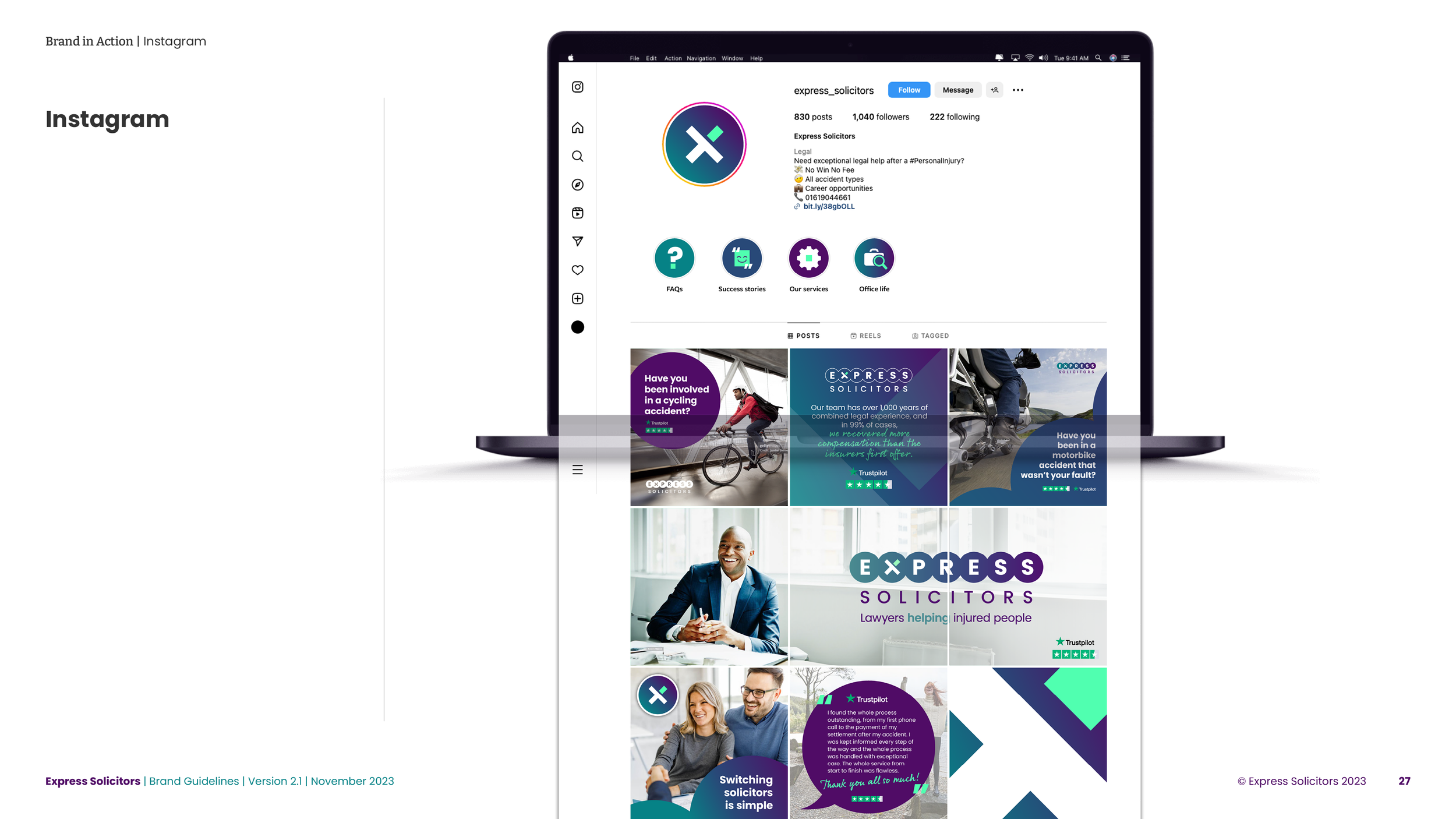
Express Solicitors are an established personal injury law firm who had an identity that felt a little tired. They wanted a brand evolution and a set of guidelines developing to ensure consistency across all the usual touch points, while communicating their personal approach to the often traumatic field of injury law. The logo, tagline and primary purple had to remain as close to the original as possible, but everything else was fair game. I updated the logo and colour palette, and created a recognisable icon that formed part of the full logo as well as being able to stand on its own. I introduced rules around photography use, graphic devices and brought in a secondary hand written font to add a relatable, humanistic tone.
The result was recognisably Express Solicitors, but with a more modern and professional identity.
Brand development for national law firm
The falling person
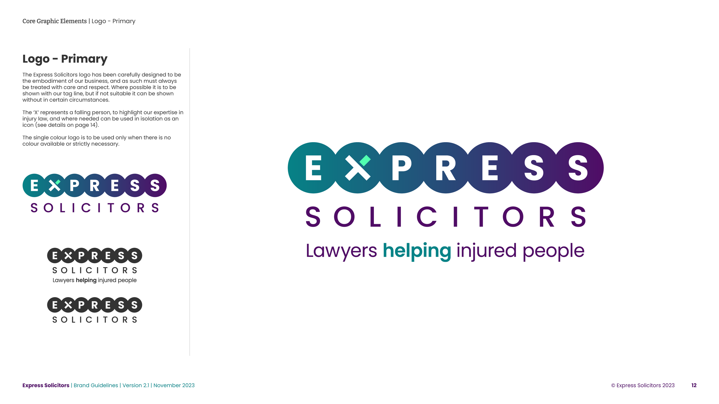
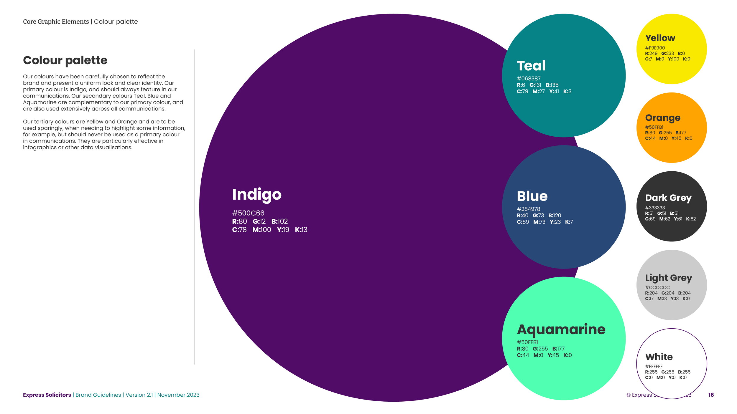
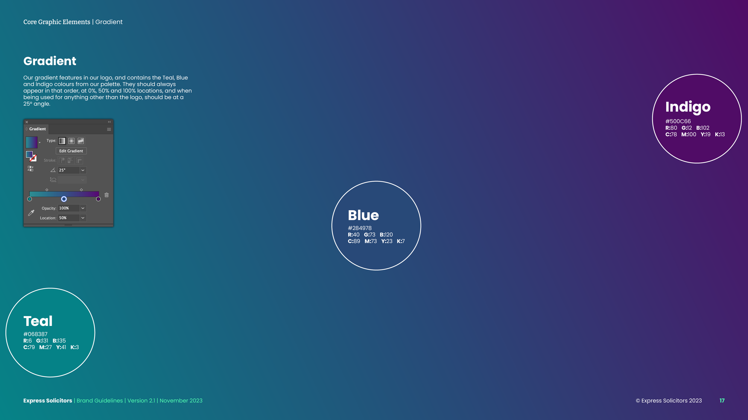
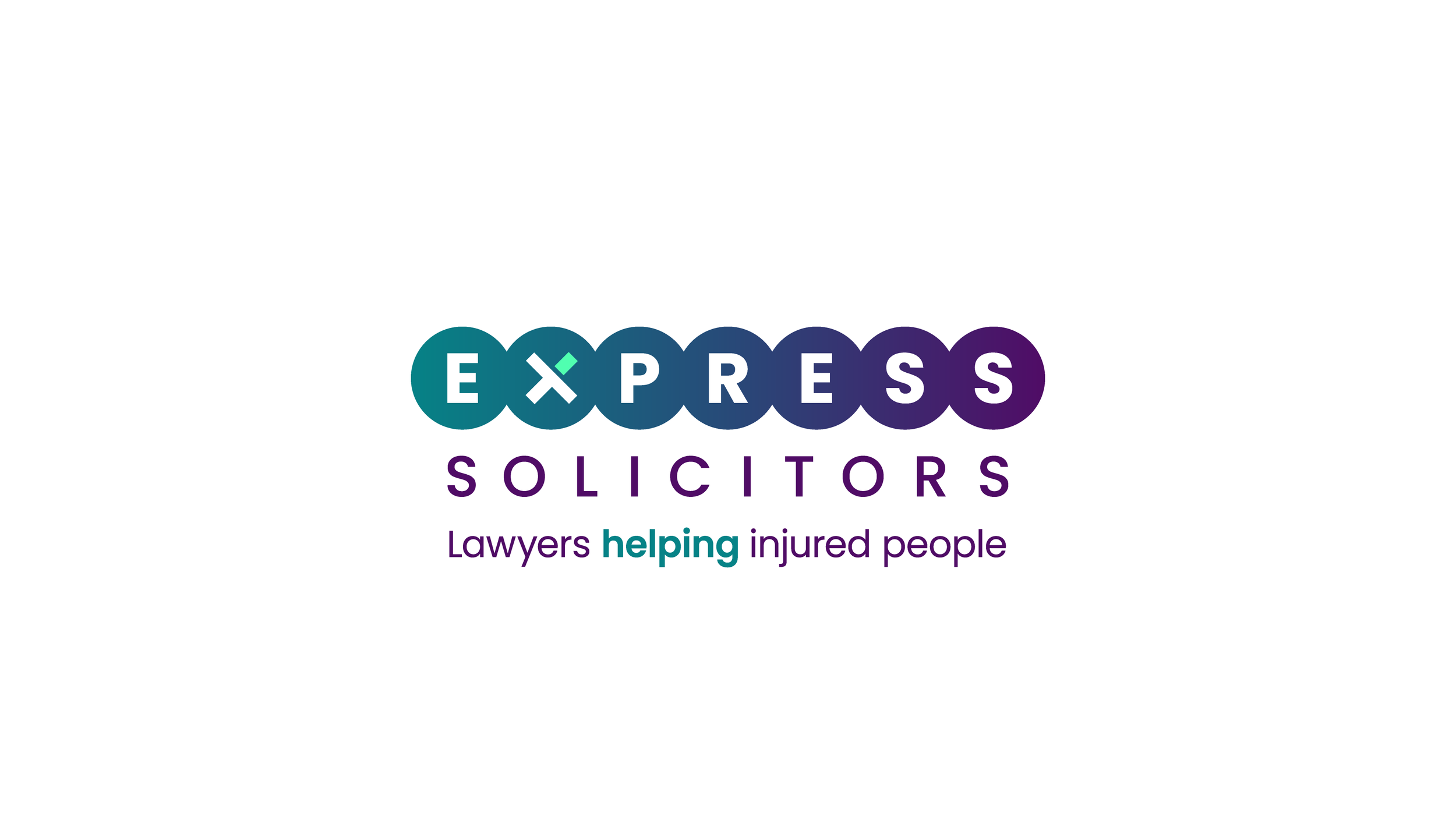
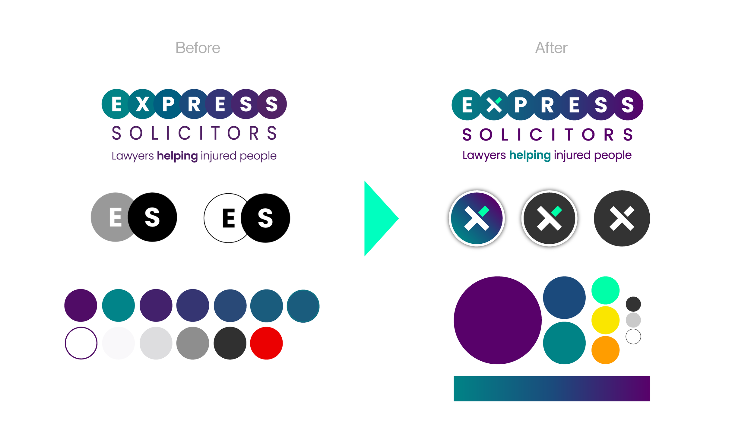
The original logo was made up of individual circles with very similar colours running from teal to purple. These colours were all in the palette, which was confusing, and the logo didn’t print with particular clarity. I kept 3 colours from the original palette and simply put a gradient across the newly joined circles. I also introduced 3 new, vibrant secondary colours to act as a point of contrast to the dark primary colours.
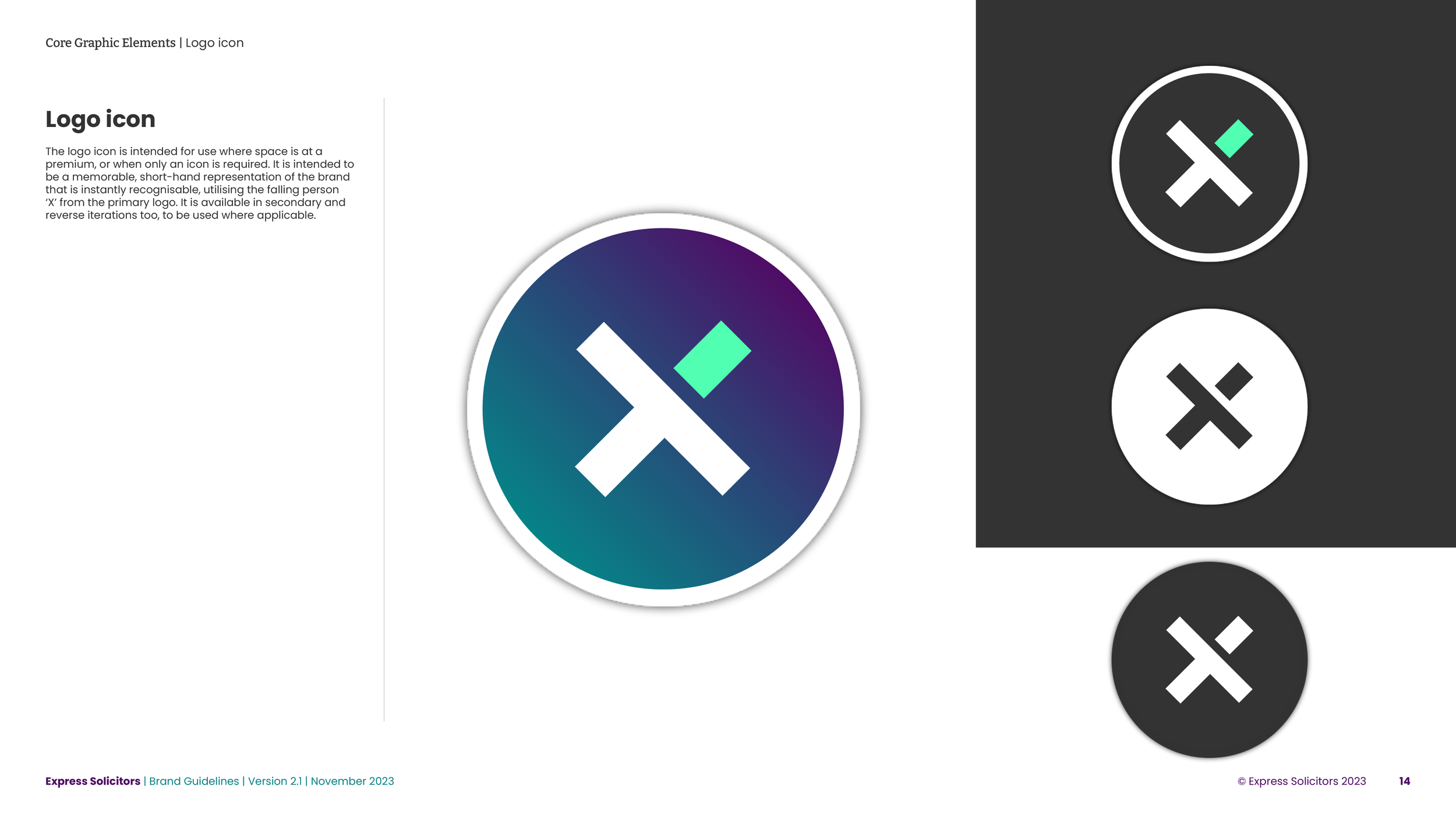
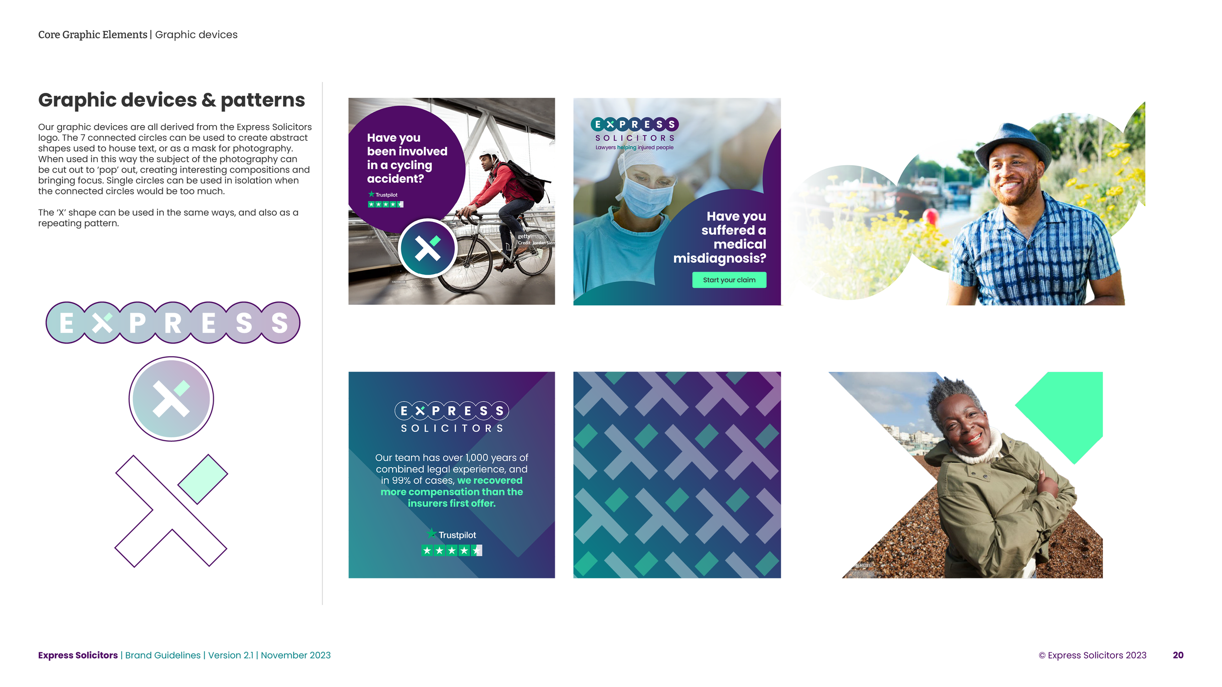
The idea with the ‘X’ in the logo was that of a ‘falling person', indicating the personal injury specialism of the firm, based on simple stick figures as an inspiration. This works as a standalone brand icon and is more identifiable than the previous ‘ES’ circles, and is one of our main graphic devices (see examples below). It will also eventually form the stylistic basis of a suite of bespoke icons.
